02 / 04
cooldown°earth – a new website for a new foundation
Categories
Team project
3D & Motion Design
Storytelling
UI/UX
Team
Lukas Woyte
Benedikt Köhler
Sebastian Reissmüller
Oliver Luxendorfer
Anna Scherzer & me
Year
2019
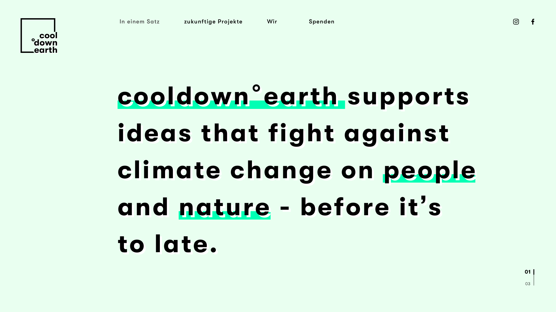
The newly established cooldown°earth foundation is dedicated to the goal of fighting ecological (CO2 emissions, sustainability) and social climate change (polarization, selfishness, division). cooldown°earth is committed to unite people across borders and motivate them to change their consumer habits towards sustainability and minimize their CO2 footprint.
Working together with artists, creative people, media, educational institutions, committed citizens and companies, the foundation wants to speed up the transition to a climate-neutral, sustainable society.
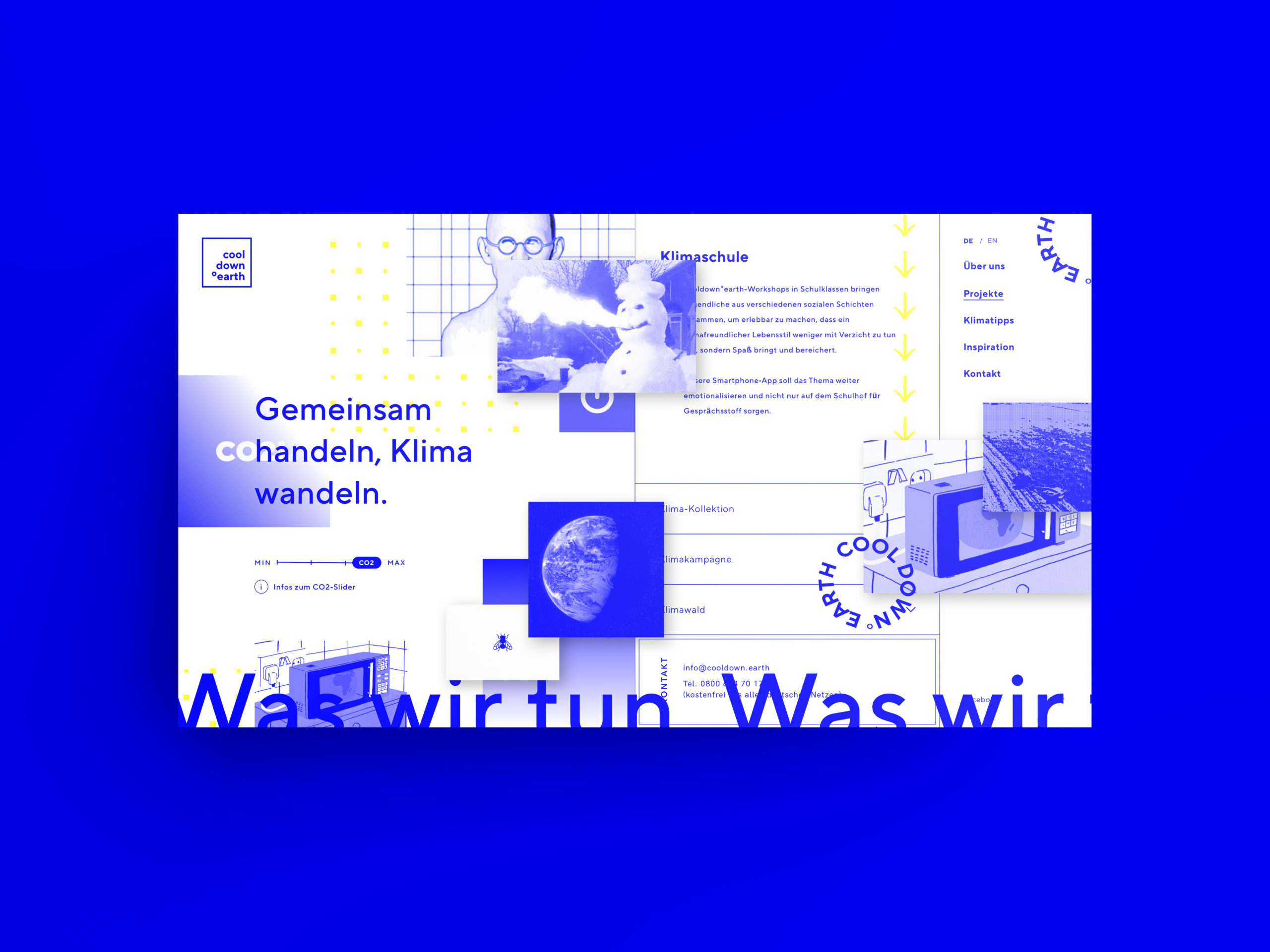
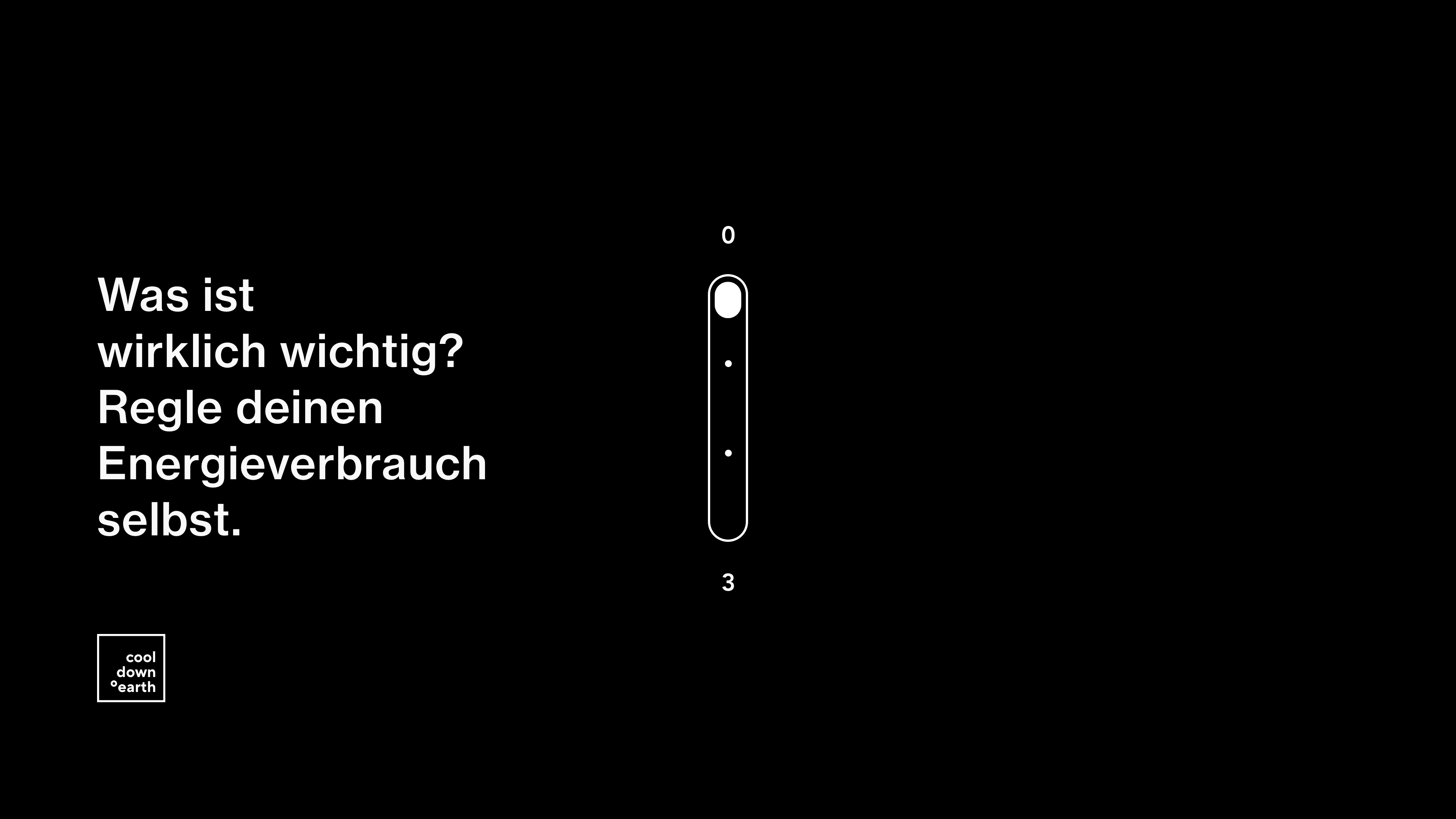
Letzte Stufe des CO2-Reglers
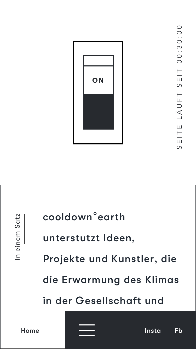
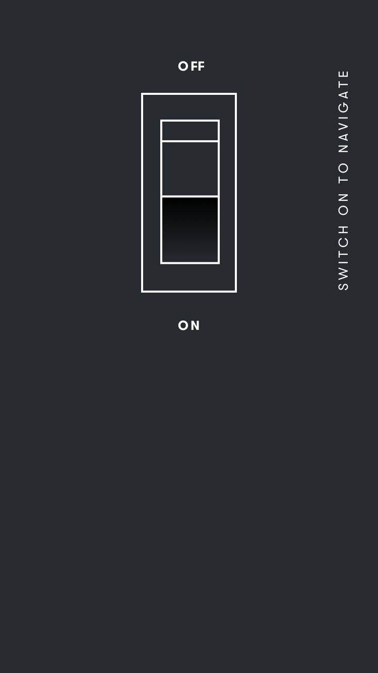
The foundations' website should reflect this mission. Therefore, the task of our team of six was to design and develop a website that would provide a unique experience in regards to the climate topic. There were several limitations. On the one hand, there should be an interactive gimmick that generates an additional benefit and refers directly to climate topics. On the other hand, there were no images available as the foundation was newly founded. The interface should be easy to use and the appearance and colour scheme should be memorable.
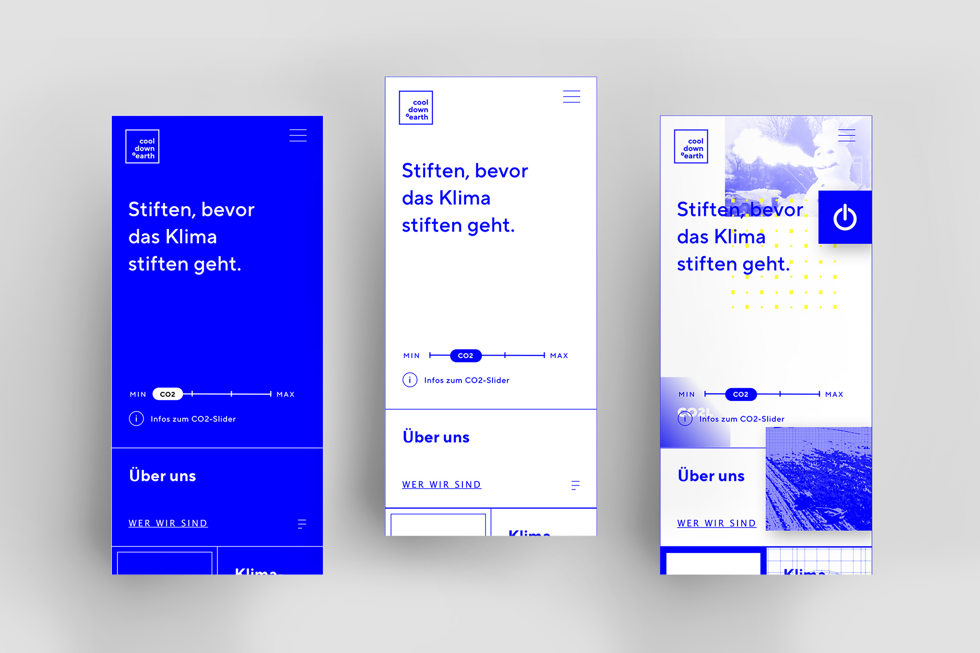
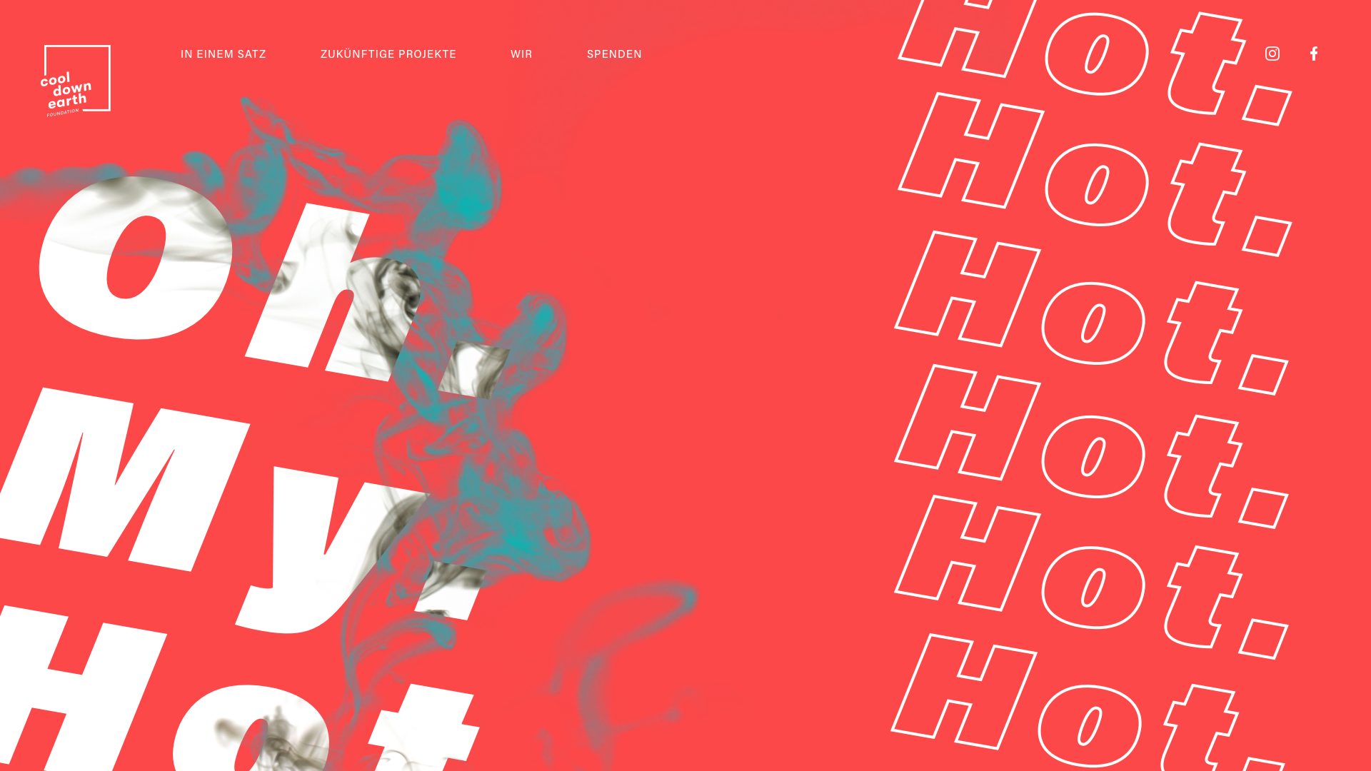
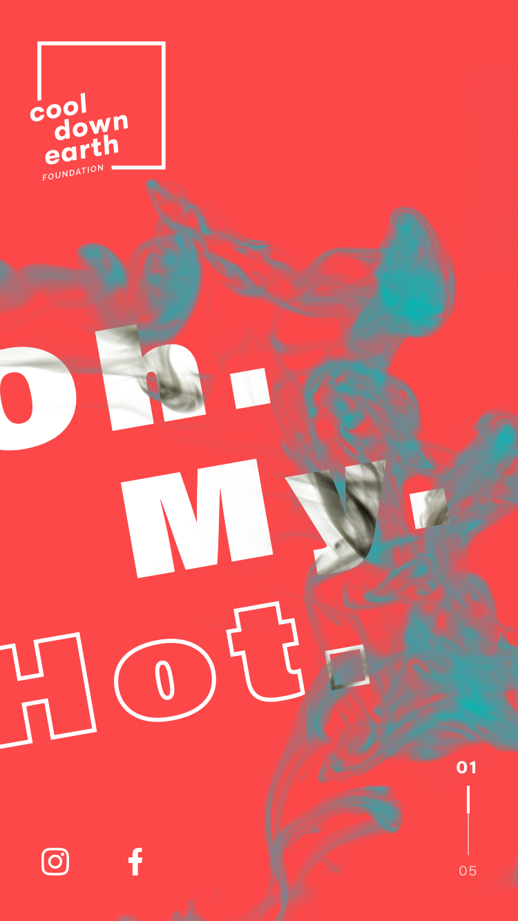
After a several weeks concept phase, during which many ideas were collected, the customer decided on the CO2 slider - a tool to regulate the website's data traffic. Visitors can use the smooth slider to control how much electricity the website consumes. Min (-) reduces the data rate and number of GIFs. Max. (+) increases the data rate and activates video streams. The more data is generated and sent, the more CO2 is generated.
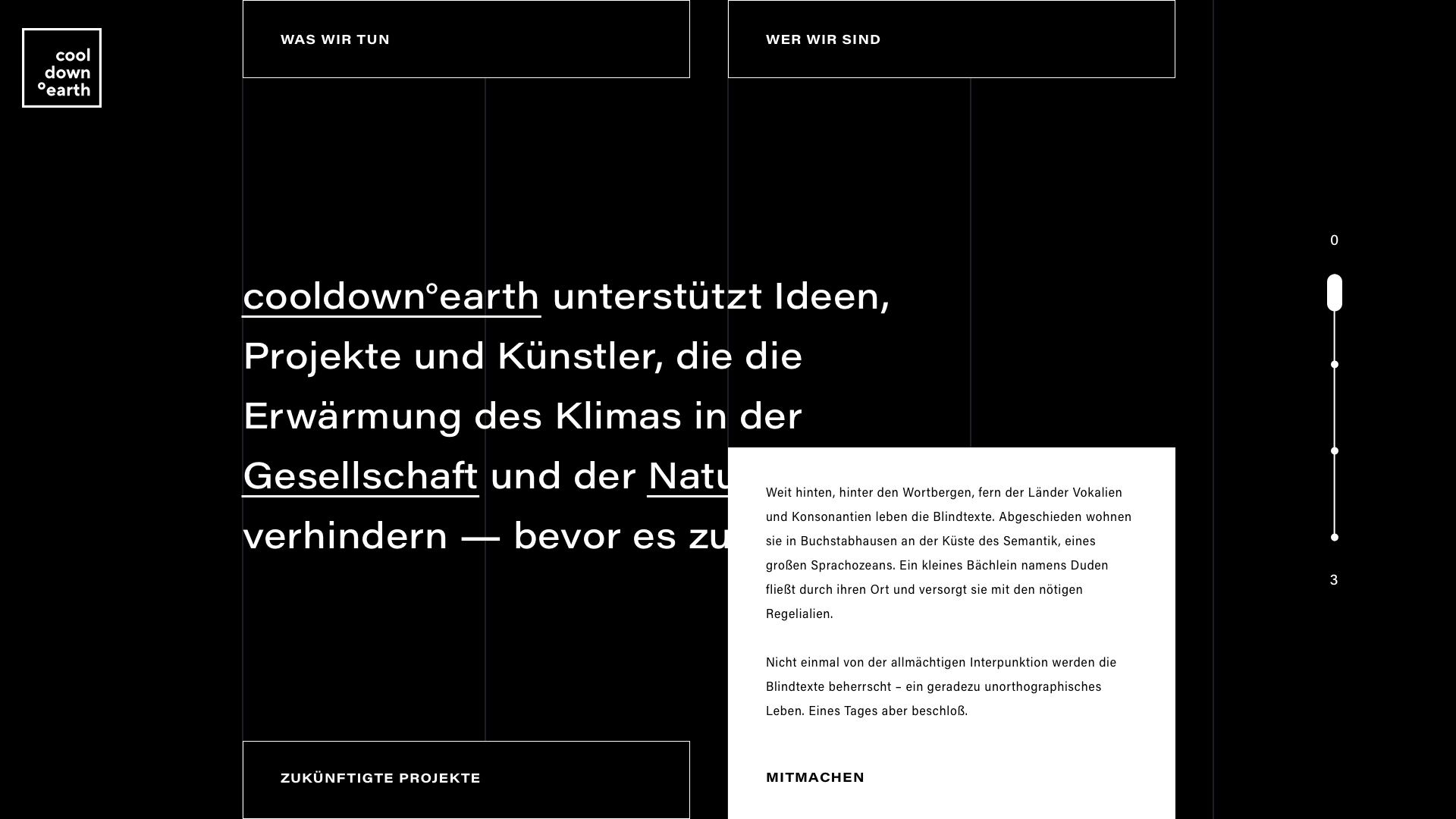
Initial state is the one with the lowest consumption, where only text is displayed on a blue background. If the slider is moved to the right, the background color changes to white - i.e. all color channels /RGB) are activated. Gradually, more and more GIF and videos appear that stereotypically address climate change. The quantity and placement of clips is becoming increasingly irritating and distracting. The highest possible setting makes it impossible for the user to absorb the content in peace.
The client eventually chose a toned down version of our idea. You can see the result of the project by clicking here:
SIMONE GLÜCK
Digital Design
